Visualizing Satellite Orbits
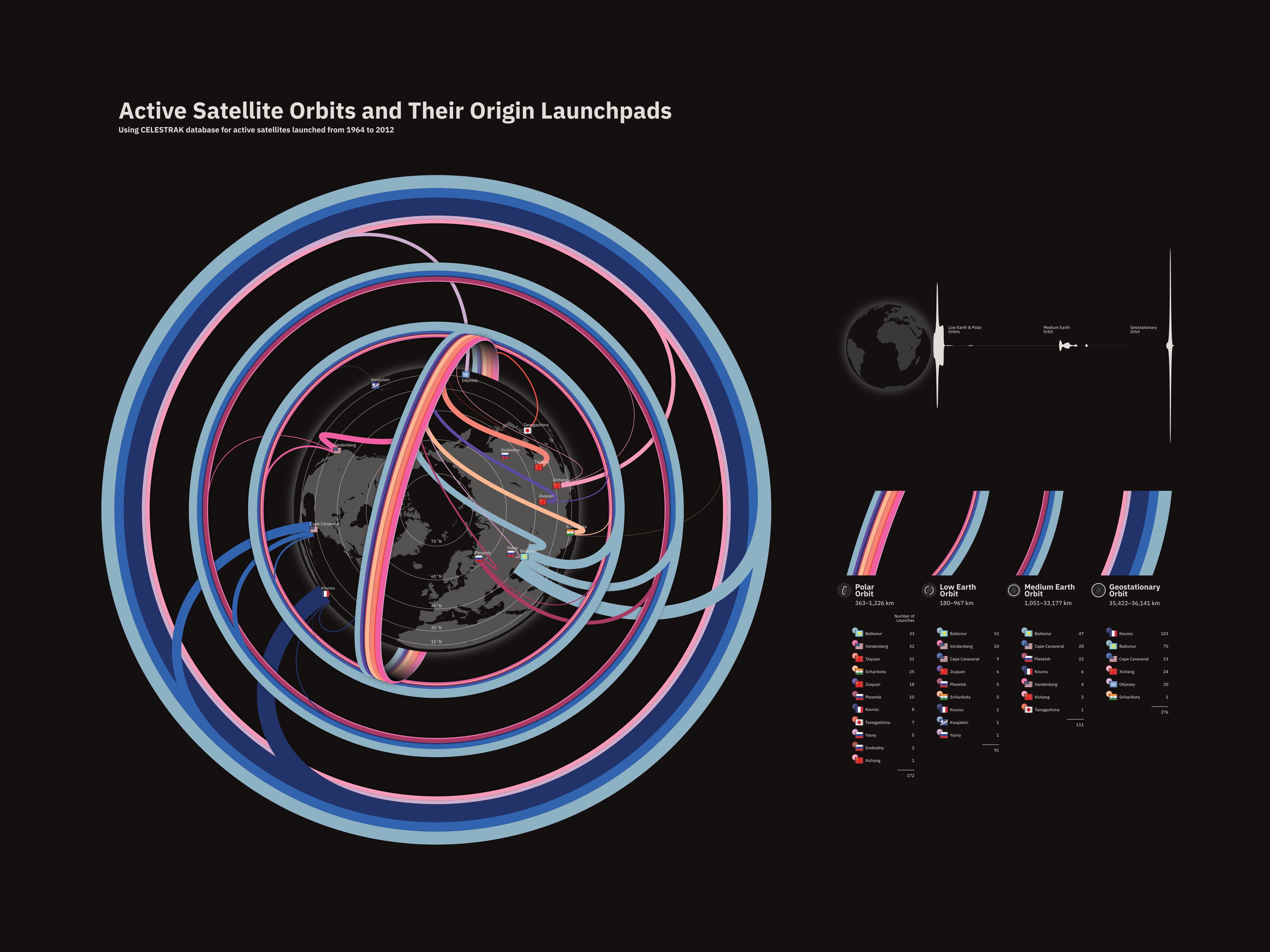
I scraped the CELESTRAK online database for information about orbital launches between 1964 and 2012. From this dataset, I chose to visualize the origin launch site and the destination orbit. The launches are shown in aggregate; each launch site has a unique color, and the thickness of the lines emanating from each launch site are proportional to the number of launches recorded during the time frame.
The primary graphic shows the number of launches from each site and the target orbit of each launch, but it doesn't convey the true altitude of the orbits above Earth. The upper right corner shows an alternate view which is true to scale with respect to altitude.
Finally, the lower right shows the table which was used to construct the primary graphic.
For a much larger version of the image, click here.