Reimagining the OONI Explorer
The OONI Geo Explorer is live here
The OONI Explorer is an excellent tool for browsing the OONI dataset, which records evidence of internet censorship through a global network of probes. Each probe measures, among other things, the connectivity of many websites from different geographic locations.
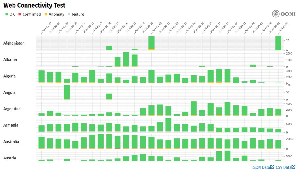
Here's the results of a query for web connectivity tests over all measured websites, and all measured countries, for the past month:
OONI Explorer, visualizing web connectivity tests from the past month.
My primary design goal in OONI Geo Explorer was to write an interactive visualization that handled the above query well. I tried to improve on the OONI default presentation by
- Making the country and date selection a little more visual and intuitive.
- Taking a more global view of the data, and allowing the user to decide how much they want to see at once.
The first improvement is achieved by introducing new controls for selecting countries and dates. Countries are selected by a zoom-able and pan-able map, and dates are selected by a zoom-able and pan-able timeline. Both views double as viewports through which data from the dataset is presented. The map is used to show the results of the web connectivity test, while the timeline is used to show the time that each sample was taken.
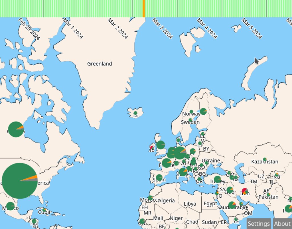
Here's the final interface:
The OONI Geo Explorer, showing the past few days of web connectivity tests for North America, North Africa, and Europe.
 At the top of the screen, we see the timeline, where each green bar represents
a sample which has been downloaded from OONI's API. Only one sample is shown
at a time, and it's colored orange. Mousing over the timeline changes the
selected sample. Dragging the timeline, or using the scroll-wheel, change the
date range, which causes the Geo Explorer to re-query the API and re-populate
the timeline.
At the top of the screen, we see the timeline, where each green bar represents
a sample which has been downloaded from OONI's API. Only one sample is shown
at a time, and it's colored orange. Mousing over the timeline changes the
selected sample. Dragging the timeline, or using the scroll-wheel, change the
date range, which causes the Geo Explorer to re-query the API and re-populate
the timeline.
The rest of the screen is dedicated to the map view. Like the timeline, the map view can be dragged or scrolled. Both cause the portion of the map shown to change, also causing the Geo Explorer to re-query the OONI API, requesting samples that involve the countries which are visible on-screen. Inside each country is rendered a pie chart, representing the percentage of requests that were normal (green), anomalous (yellow), blocked (red), or erroneous (gray). The area of the pie chart is proportional to the number of samples from the corresponding country in the sample.
Insights
The OONI Geo Explorer is well suited for scrubbing across large time scales and over large geographic regions. It can also expose interesting artifacts of OONI's measurement technique.
As a first example, consider the below image of the OONI Geo Explorer set to query instagram.com domains from 2021 through to 2023.
instagram.com is sparsely sampled, but sampled more often in Russia after 2022, when it was blocked.
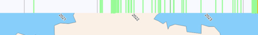
Instagram is not sampled periodically in Russia, or even particularly frequently. It was sampled just once in 2021, and far more often in 2022 and 2023. Since Instagram was blocked in Russia at the beginning of 2022, it's likely that the domain was sampled more in Russia to confirm this censorship event.
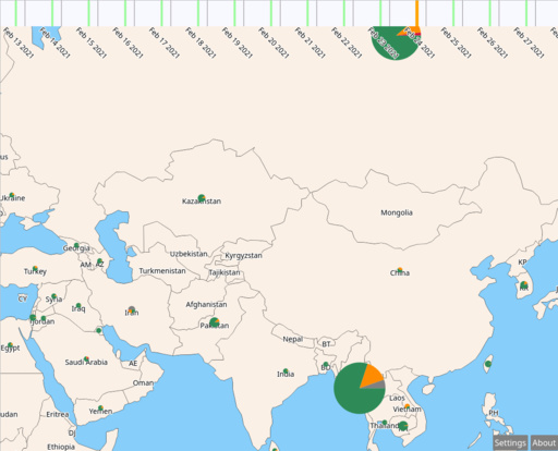
On Feb 24, 2021, a similar anomaly occurs when Myanmar was sampled vastly more than usual. Myanmar's overall sample rate increased at the beginning of the month, possibly in response to the 2021 coup d'état, and continues into the following month. On the 24th, however, Myanmar was sampled much more often (see below, c.f. Russia).
Myanmar gains sudden interest on Feb 24 2021, after the coup d'état at the beginning of the month.
Data on OONI is collected from users of an app called OONI Probe. After users install the app, they can run web connectivity tests on a broad suite of websites, or certain websites in particular. When opening the app for the first time, users a prompted for a message asking if they would like OONI Probe to sample sites periodically in the background. I hypothesize that not many users choose this option.
Furthermore, it seems that users may choose to scan websites which they suspect may be blocked in the first place. This may explain why scans of Instagram were more common after it was blocked in Russia, or scans overall were more common after the coup d'état in Myanmar. The risk, of course, is that some censorship events may go unnoticed if sites aren't scanned regularly.
Implementation
OONI Geo Explorer is written in about 1500 lines of ClojureScript. The implementation is split into three major components; the map renderer, the timeline renderer, and the "glue" which detects when either have changed, and requests the OONI API for the missing samples.
When the webpage loads, it requests a blob of JSON data describing the outlines of each country, country names, and 2-letter country codes. This data is pre-processed on the client in order to project it into "screen space" (since the data is recorded as lists of latitude and longitude angles), and to calculate bounding boxes for each country, which are used to quickly test if a country is on screen. The visible parts of the map, along with the timeline viewer, are rendered to the canvas on each frame.
One technical challenge in rendering the timeline viewer was finding an efficient representation of the database of OONI samples which are downloaded from the API as the user navigates the page. There are two critical operations on this dataset:
- Find all of the samples within a time-slice
- Find the nearest sample to a particular point
The implementation uses a binary search tree to partition the timeline on each point in the dataset (a k-d tree, where d=1), which can complete both of these operations quickly. The tree is especially handy for goal 1, because the search algorithm can easily coalesce samples which are close together, allowing the renderer to draw these samples just once.
All of the source code for the tool is hosted here on GitHub.
Future Work
There's lots of ways that the Geo Explorer could be improved from this simple proof-of-concept. OONI has exposed many kinds of tests, not just web connectivity, which would be naturally presented in the Geo Explorer interface as well.
One major aspect to improve is the coarseness of the location data used to represent each country. Each sample in the OONI dataset has a corresponding autonomous system number, and it would be interesting to render some representation of those ASNs as opposed to aggregating each sample from a country into a single pie chart. Such a change would hopefully shed some light on events where one autonomous system in a country blocks a site, but others do not, or vise versa.
The map view could also be made more interesting by rendering data from alternate sources as well as from OONI. The RIPE Atlas, for example, has interesting data on BGP traffic between autonomous systems. Additional data sources such as RIPE might help the Geo Explorer expose the dynamic and interconnected nature of the internet, and help us interpret more nuanced internet censorship events.